2分で読める
CSSで美しい気泡アニメーションを作る
純粋なCSSとJavaScriptで実装する、浮遊する気泡エフェクトのチュートリアル
ウェブサイトに動きのあるアクセントを加えたいとき、気泡(バブル)アニメーションは非常に効果的です。この記事では、純粋なCSSとJavaScriptを使って美しい気泡エフェクトを実装する方法を解説します。
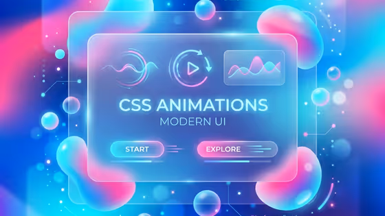
完成イメージ
水中を浮遊するような気泡が、画面下から上へとゆっくり浮かび上がるエフェクトを作ります。各気泡はランダムなサイズ、速度、横方向の揺れを持ちます。
Step 1: HTML構造
まず、気泡を配置するコンテナを用意します。
<div class="bubble-container">
  <!-- 気泡は JavaScript で動的に生成します -->
</div>
Step 2: 基本的なCSS
コンテナと気泡の基本スタイルを定義します。
.bubble-container {
  position: fixed;
  top: 0;
  left: 0;
  width: 100%;
  height: 100%;
  pointer-events: none;
  overflow: hidden;
  z-index: -1;
}

.bubble {
  position: absolute;
  bottom: -100px;
  background: radial-gradient(
    circle at 30% 30%,
    rgba(255, 255, 255, 0.8),
    rgba(255, 255, 255, 0.2) 50%,
    transparent 70%
  );
  border-radius: 50%;
  opacity: 0.6;
  animation: rise linear infinite;
}
ヒント
pointer-events: none を設定することで、気泡がクリックやホバーの邪魔をしないようにします。
Step 3: 浮上アニメーション
気泡が下から上へ浮かび上がるアニメーションを定義します。
@keyframes rise {
  0% {
    transform: translateY(0) translateX(0);
    opacity: 0;
  }
  10% {
    opacity: 0.6;
  }
  90% {
    opacity: 0.6;
  }
  100% {
    transform: translateY(-110vh) translateX(var(--drift, 0px));
    opacity: 0;
  }
}
Step 4: 横方向の揺れ
より自然な動きを出すために、横方向の揺れを追加します。
@keyframes wobble {
  0%, 100% {
    transform: translateX(0);
  }
  25% {
    transform: translateX(-20px);
  }
  75% {
    transform: translateX(20px);
  }
}

.bubble {
  /* 既存のスタイルに追加 */
  animation:
    rise linear infinite,
    wobble ease-in-out infinite;
}
Step 5: JavaScript で動的に生成
ランダムなサイズと速度の気泡を生成します。
function createBubble() {
  const bubble = document.createElement('div');
  bubble.className = 'bubble';

  // ランダムなサイズ (10px ~ 60px)
  const size = Math.random() * 50 + 10;
  bubble.style.width = `${size}px`;
  bubble.style.height = `${size}px`;

  // ランダムな水平位置
  bubble.style.left = `${Math.random() * 100}%`;

  // ランダムな浮上速度 (8秒 ~ 15秒)
  const duration = Math.random() * 7 + 8;
  bubble.style.animationDuration = `${duration}s, ${duration / 2}s`;

  // ランダムな横方向のドリフト
  const drift = (Math.random() - 0.5) * 100;
  bubble.style.setProperty('--drift', `${drift}px`);

  // ランダムな遅延
  bubble.style.animationDelay = `${Math.random() * 5}s`;

  return bubble;
}

function initBubbles(count = 15) {
  const container = document.querySelector('.bubble-container');

  for (let i = 0; i < count; i++) {
    const bubble = createBubble();
    container.appendChild(bubble);
  }
}

// ページ読み込み時に実行
document.addEventListener('DOMContentLoaded', () => {
  initBubbles(15);
});
Step 6: 完全なコード
すべてをまとめた完全なコードです。
<!DOCTYPE html>
<html lang="ja">
<head>
  <meta charset="UTF-8">
  <meta name="viewport" content="width=device-width, initial-scale=1.0">
  <title>気泡アニメーション</title>
  <style>
    * {
      margin: 0;
      padding: 0;
      box-sizing: border-box;
    }

    body {
      min-height: 100vh;
      background: linear-gradient(135deg, #1a1a2e 0%, #16213e 50%, #0f3460 100%);
    }

    .bubble-container {
      position: fixed;
      top: 0;
      left: 0;
      width: 100%;
      height: 100%;
      pointer-events: none;
      overflow: hidden;
      z-index: 1;
    }

    .bubble {
      position: absolute;
      bottom: -100px;
      background: radial-gradient(
        circle at 30% 30%,
        rgba(255, 255, 255, 0.8),
        rgba(255, 255, 255, 0.3) 40%,
        rgba(255, 255, 255, 0.1) 60%,
        transparent 70%
      );
      border: 1px solid rgba(255, 255, 255, 0.2);
      border-radius: 50%;
      box-shadow:
        inset 0 -5px 20px rgba(255, 255, 255, 0.1),
        0 0 20px rgba(255, 255, 255, 0.1);
      animation:
        rise linear infinite,
        wobble ease-in-out infinite;
    }

    @keyframes rise {
      0% {
        transform: translateY(0) scale(1);
        opacity: 0;
      }
      10% {
        opacity: 0.6;
      }
      90% {
        opacity: 0.4;
      }
      100% {
        transform: translateY(-110vh) translateX(var(--drift, 0px)) scale(0.8);
        opacity: 0;
      }
    }

    @keyframes wobble {
      0%, 100% {
        margin-left: 0;
      }
      25% {
        margin-left: -15px;
      }
      75% {
        margin-left: 15px;
      }
    }
  </style>
</head>
<body>
  <div class="bubble-container"></div>

  <script>
    function createBubble() {
      const bubble = document.createElement('div');
      bubble.className = 'bubble';

      const size = Math.random() * 50 + 10;
      bubble.style.width = `${size}px`;
      bubble.style.height = `${size}px`;
      bubble.style.left = `${Math.random() * 100}%`;

      const duration = Math.random() * 7 + 8;
      bubble.style.animationDuration = `${duration}s, ${duration / 2}s`;

      const drift = (Math.random() - 0.5) * 100;
      bubble.style.setProperty('--drift', `${drift}px`);
      bubble.style.animationDelay = `${Math.random() * 5}s`;

      return bubble;
    }

    function initBubbles(count = 15) {
      const container = document.querySelector('.bubble-container');
      for (let i = 0; i < count; i++) {
        container.appendChild(createBubble());
      }
    }

    document.addEventListener('DOMContentLoaded', () => initBubbles(15));
  </script>
</body>
</html>
カスタマイズのヒント
色付きの気泡
.bubble.blue {
  background: radial-gradient(
    circle at 30% 30%,
    rgba(100, 200, 255, 0.8),
    rgba(100, 200, 255, 0.2) 50%,
    transparent 70%
  );
}

.bubble.pink {
  background: radial-gradient(
    circle at 30% 30%,
    rgba(255, 150, 200, 0.8),
    rgba(255, 150, 200, 0.2) 50%,
    transparent 70%
  );
}
パフォーマンス最適化
注意
多数の気泡を表示する場合は、will-change: transform を追加してGPUアクセラレーションを有効にしましょう。ただし、使いすぎるとメモリ消費が増えるので注意が必要です。
.bubble {
  will-change: transform, opacity;
}
クリックで気泡を追加
インタラクティブな要素として、クリックで気泡を追加する機能も実装できます。
document.addEventListener('click', (e) => {
  const bubble = createBubble();
  bubble.style.left = `${e.clientX}px`;
  bubble.style.bottom = `${window.innerHeight - e.clientY}px`;
  document.querySelector('.bubble-container').appendChild(bubble);

  // アニメーション終了後に削除
  setTimeout(() => bubble.remove(), 15000);
});
まとめ
CSSアニメーションとJavaScriptを組み合わせることで、美しい気泡エフェクトを実装できました。このテクニックは以下のような場面で活用できます:
- ランディングページの背景装飾
- 水族館や海をテーマにしたサイト
- ローディング画面のアクセント
- インタラクティブなユーザー体験の演出
ぜひ自分のプロジェクトでカスタマイズして使ってみてください。
